Jo Zixuan
MFA Graphic Design
Situational 情境中
The Chinese title 情境中 (qing jing zhong) translates directly to in the situation. Yet separately as three individual characters, qing jing zhong means emotion, scene, within. A situation in my language is inherently an emotional scene, which requires us to account for more than the objective conditions, such as the geographical, economic, and social circumstances, as well as the subjective and affective experiences of individuals.
How can design be used to analyze the context of given situations and construct new situations? The key terms organizing this book describe a movement. Site establishes the levels of context in which any practice is embedded: place, organization, body, and their continuous interaction across time. Situate names the conditions that shape the maker's positionality within those sites. Situational describes the practice of reading those conditions analytically and responding to them fluidly. Situationist takes all of that outward. Having understood the context, named the position, and learned to respond to conditions, the question becomes: what new situations can be constructed for others? How do you use that understanding to intervene in the world rather than simply describe it?
Image
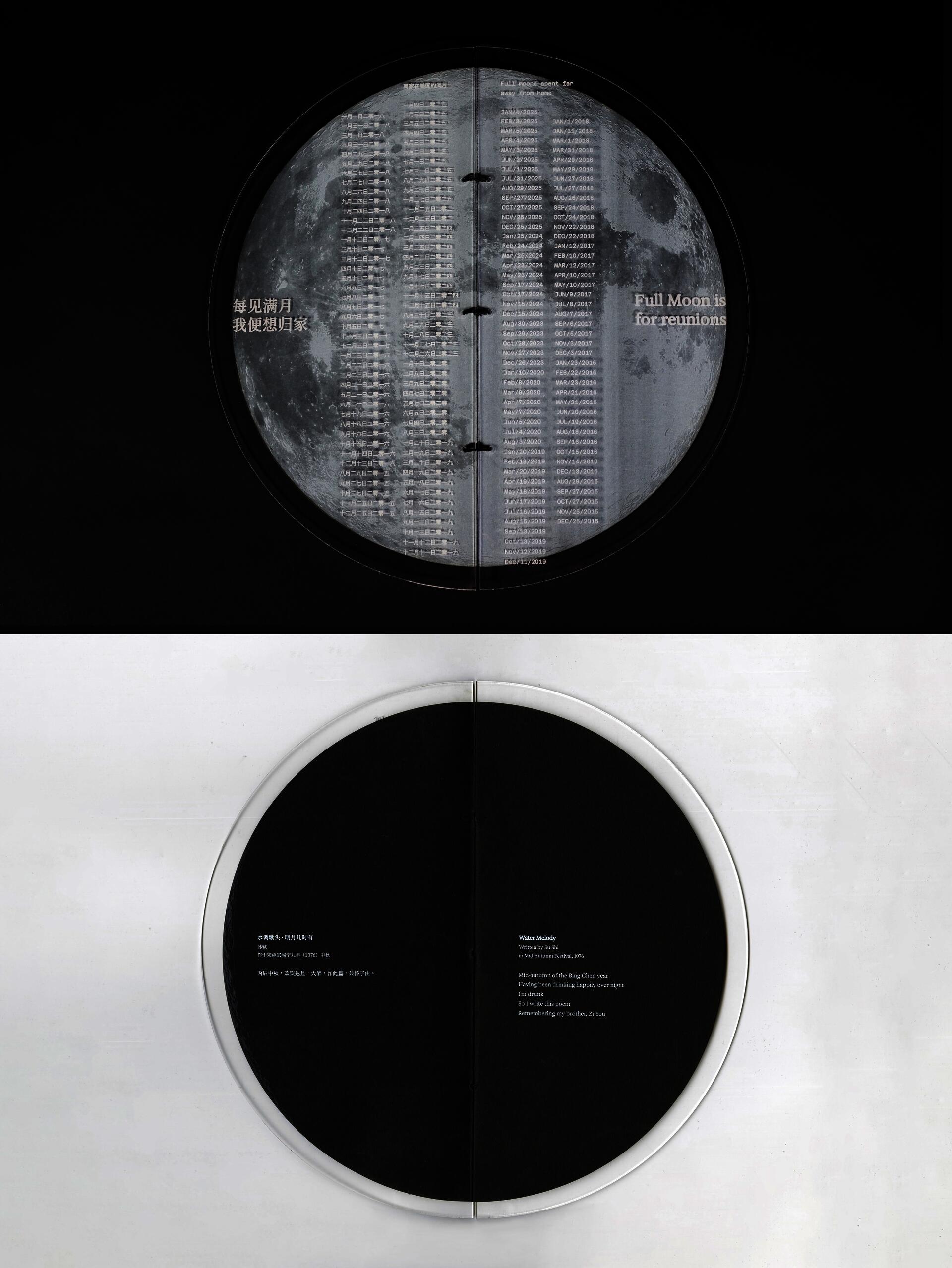
Title: Full Moon is for Reunion
Hard cover sewn art book
6 × 12"
The full moon is a symbol of reunion in China. It’s celebrated in the Mid-Autumn Festival, when people travel back to their hometowns and enjoy mooncakes with family. This circular book recreates the waning and waxing of the moon cycle, similar to a lunar calendar. The book cover is etched with the dates of every full moon I spent in the United States, away from my family. It also includes a well-known Chinese poem Water Melody by Su Shi. Written in 1076, during the Mid-Autumn Festival, the poem expresses Su Shi’s homesickness. It moves from yearning for reunion to finding solace in the shared beauty of the moon, even across distances.
Image
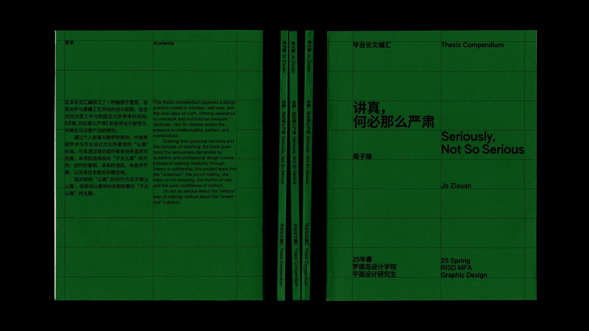
Seriously, Why So Serious
Soft cover perfect bound book.
6.5 × 8.7"
This thesis compendium explores a design practice rooted in intuition, self-care, and the slow labor of craft, offering resistance to overwork and institutional pressure. Seriously, Not So Serious resists the pressure to intellectualize, perfect, and overproduce.
Drawing from personal narrative and the textures of teaching, the book questions the seriousness demanded by academic and professional design culture.Instead of seeking credibility through theory or authorship, this project leans into the “unserious”: the joy of making, the mess of not knowing, the rhythm of rest, and the quiet confidence of instinct.
I’m not so serious about the “serious” way of making; serious about the “unserious” subjects.
Image
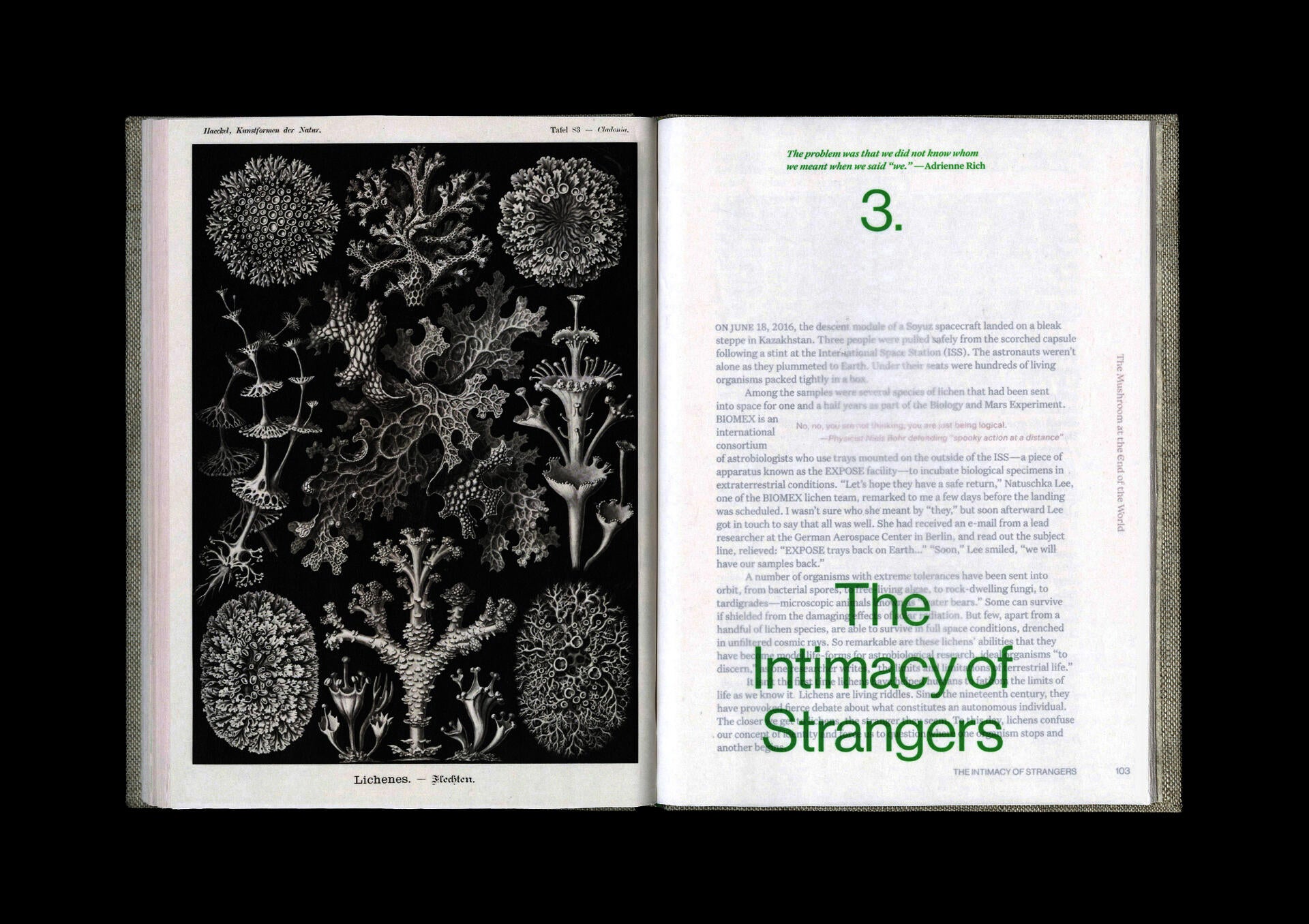
Entangled Life
Hard cover perfect bound
6.8 × 9.4"
This art book interweaves two writings about mushrooms: using Entangled Life as the main text and The Mushroom at the End of the World as the secondary text. These two books explore the intricate symbiotic relationship between mushrooms and the natural ecosystem from different perspectives. The book design uses fungal growth as a visual metaphor, allowing the secondary text to “grow” randomly from the pages, like mushrooms popping up at random places after the rain, creating a hybrid form where a book exists within a book. The interruptions form a latent network, sprouting in random corners and spreading unchecked.
Image

The Bible-Leaved Sperm Whale
In the 19th century whaling industry, whales were captured and cut into small pieces to harvest their whale oil. They were first cut into “blanket pieces”, then separated into “horse pieces.” The smallest cut size was called “bible leaves”, because it resembles the size of the common bible. The project features a bible-sized book and whale-scale installation together as a scale comparison. They share the same number of printed pages. If the 1,368 pages in the book were pulled apart and collaged together, the result is the installation. It displays the super-sized word “sperm whale” in 33.5 feet in length, the same size as a female sperm whale. The grey letters on blue paper allow the viewers an immersive experience of a whale at sea. The installation is a reversal of the cutting process, leaving the printing margin a symbol of the violent act.
Video file
Illegible Pattern
Illegible Pattern is a random pattern generator. This vibe-coded tool takes the phrase type as image to the extreme, allowing graphic designers to look at typesetting purely from a form-based perspective. It uses a variable font of geometric glyphs to create endless possibilities of composition. The users can customize the font size, letter spacing, and underline to customize their own illegible patterns. The colorful UI and sound effect set the tone for a joyful playground that doesn’t lead to practical purposes.
Visit https://illegible-pattern.jozixuan.com to play with it on the desktop.
Image
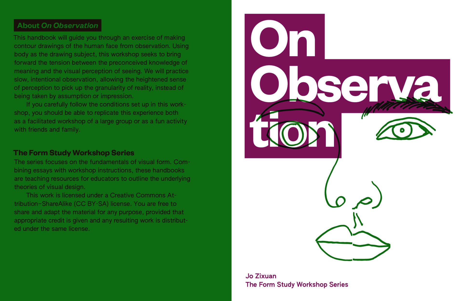
On Observation
This handbook will guide you through an exercise of making contour drawings of the human face from observation. Using body as the drawing subject, this workshop seeks to bring forward the tension between the preconceived knowledge of meaning and the visual perception of seeing. We will practice slow, intentional observation, allowing the heightened sense of perception to pick up the granularity of reality, instead of being taken by assumption or impression.
If you carefully follow the conditions set up in this workshop, you should be able to replicate this experience both as a facilitated workshop of a large group or as a fun activity with friends and family.
Image
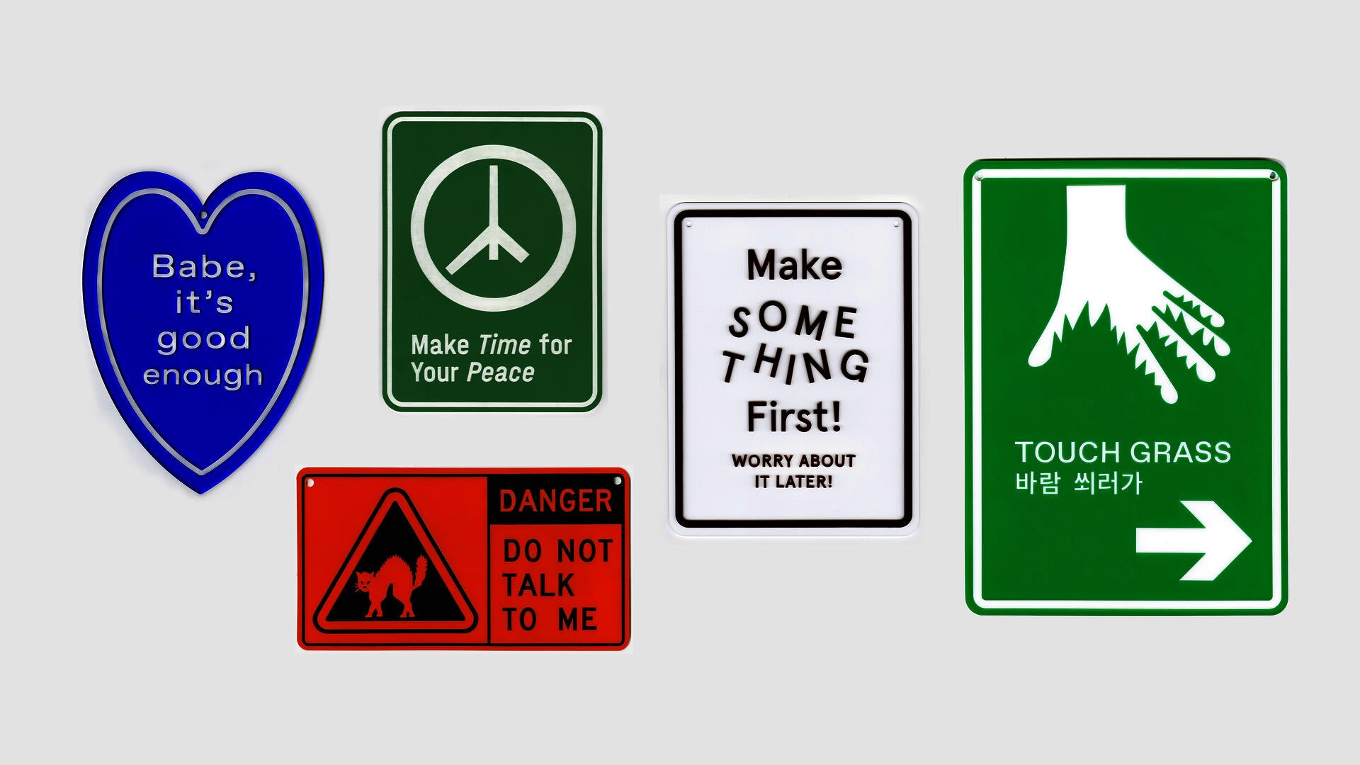
Jo's Sign Service
We all find ourselves in patterns of behaviors we are aware of repeating. We want to work towards a certain change, but the environmental structure often doesn’t support that effort. Public signages shape every step of our way in public spaces. Can we appropriate that power to shape the behavior in a private environment?
Jo’s Sign Service makes private signs for close friends and family to help with their problems. These personal reminders and public announcements construct a situation for us to face the frictions in life. The challenges are externalized through this format. Signage gives that language a tone of command. Each sign was crafted for a specific someone, but their problems are universal.
Image
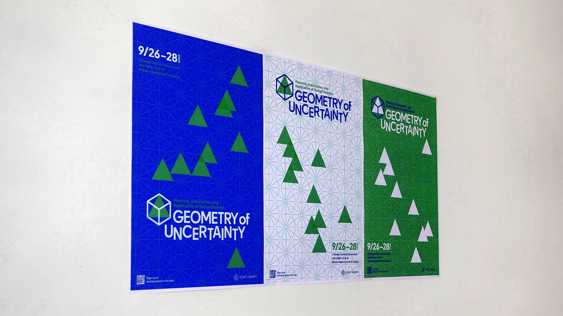
Geometry of Uncertainty
The 2025 Design Science Symposium, Geometry of Uncertainty, was inspired by an initiative to expand applications of the Arthur Loeb Design Science Teaching Collection & Archive. The events brought together scholars, makers, educators, and students to explore the applications of visual mathematics and nature-inspired design in art and design education.
I was tasked with designing the visual identity of this symposium. The visual direction was inspired by mathematical diagram and tessellation, using modularity and mathematical grid to creates order and precision in a dynamic design system.
Image
Rhode Island School of Design
20 Washington Place
Providence, RI 02913–2784
United States of America
+1 401 454 6100
+1 800 364 RISD
QUICK LINKS
risd.edu
Graduate Studies
Image
Rhode Island School of Design
20 Washington Place
Providence, RI 02913–2784
United States of America
+1 401 454 6100
+1 800 364 RISD